Seriously, thought picking colors for my new coffee shop logo would be a breeze. Got a call yesterday morning: “Need options by lunchtime!” Panic mode activated. Remembered something vague about color psychology being a shortcut, so I dove in headfirst. Grabbed my laptop and just started googling like crazy.
The Initial Mess-Up
My first thought was “Cool colors feel calm!”. Ran straight for blues and greens. Pulled them into a design tool. Threw a dark green circle around a simple coffee cup icon. Added some light blue text underneath saying “Morning Roast”. Showed it to my wife. She squinted. “Looks like a… fancy pharmacy?” Oof. Felt like a gut punch. Totally off track. Wrong vibe completely.
Flipping the Script
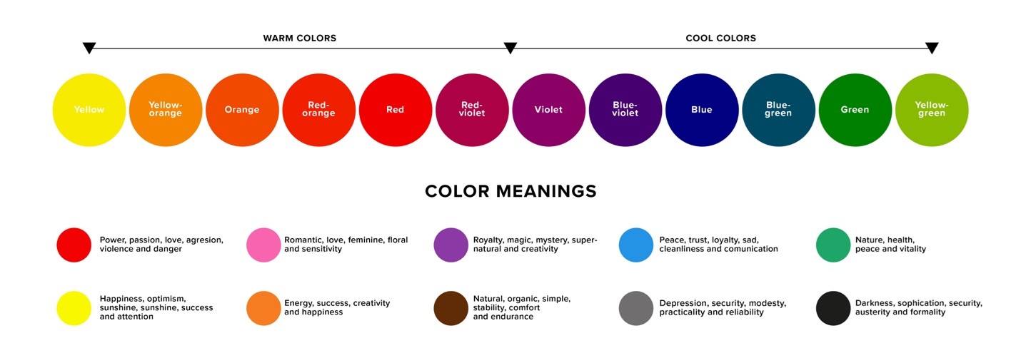
Scrapped the cool colors. Okay, time to actually read what the internet says about coffee. Duh! Should have started here. Seems like everyone agrees on a few things:
- Brown: Earthy, coffee grounds, comfort.
- Greens: Freshness, natural, beans. Gotta be careful with the shade though!
- Reds/Oranges: Energy, warmth, that good caffeine kick. Maybe hints of cherry notes?
- Dark Greys/Blacks: Bold, rich, strong brew.
Right. Brown had to be the star. Went back to the design tool. Chose a rich, warm chocolate brown (#7B3F00 if you care – but honestly, just looked for one that felt like melted chocolate). Made this brown the main background color for a badge shape.
Playing with Combos
Brown alone felt flat. Needed a partner. Tried adding a creamy beige (#F5F5DC) for text inside the badge. Instantly better. Felt smooth, luxurious, like steamed milk. Good contrast too. Still needed that pop though. Remembered “warmth” and “energy.” Added a small coffee icon on the badge. Tried coloring it a deep, earthy red (#A52A2A). Perfect! It wasn’t screaming “fire truck,” it felt warm and strong, like a shot of espresso. Pulled the eye right to it.
Played with a leaf icon? Nope. Too fussy. Tried an orange accent? Too jarring. Stuck with the deep red. Checked black text for the main name “Morning Roast” – crisp and readable on the beige.
The Fast Finale
Stared at the screen. Brown background badge. Creamy beige text inside. Deep red coffee icon. Black shop name. Simple. Clean. It screamed “Coffee!” instantly. Sent it off five minutes before lunchtime deadline. Client called back an hour later: “Love it. Nailed it. Using the badge.” Boom! Felt satisfying.
Moral? Don’t just guess with colors like I tried first. Those basic psychology rules – brown for earth, cream for comfort, warm red for energy – they aren’t magic, but dang, they point you in the right direction FAST when you’re sweating a deadline.